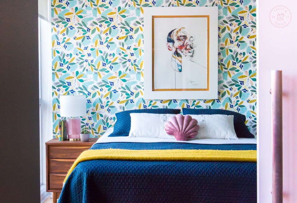
I am very excited to welcome you to my first ever home decor post on the Taste & Tipple blog! YAY!
When I founded the blog back in 2017, I always hoped to speak to both food and lifestyle. In the past two years, food has certainly dominated the content aside from the occasional gift guide, travel posts, or best-of lists. As anyone who knows me will tell you, I am a bit of a perfectionist – especially when it comes to home decor.
I moved into my condo back in September 2018 and had always hoped to feature it on the blog but wanted to make sure it was JUST RIGHT before sharing.

My bedroom has no integrated lighting – no pot lights or ceiling fixtures or sconces. But I was so hellbent on finding the absolutely perfect bedside lamps that I waited for over a year to pull the trigger. I even had to have these shipped to a postal address across the border in Ogdensburg, NY because they don’t ship to Canada, but I think they were totally worth the effort. They remind me a bit of a vintage cocktail glass and I couldn’t be happier with these delightful pink glass lamps from Anthropologie.
And now I have the ability to read in bed without wearing a headlamp, so that’s a bonus.
When I bought my condo, every wall was builder white. I LOVE colour and absolutely couldn’t tolerate the bland walls, I actually started painting on the first day I took possession and rushed to get two coats up on the living/dining areas and the kitchen before moving my furniture in. Here is the before photo of my bedroom from the listing photos when I purchased it:
BEFORE

AFTER

GET THE LOOK

As you can see…it was a bit bland. While I wanted to overhaul the space immediately, I practiced patience and initially left the walls blank because I knew I wanted to do a feature wall of bright, bold wallpaper behind the bed. I didn’t want to replace my existing bedding, from West Elm, and needed to find a pattern that would compliment that colour palette. After careful consideration I opted for the Charlie wallpaper, also from Anthropologie. I think it compliments the blue bedding and bright yellow blanket perfectly.
The wallpaper was one of the first improvements I made to the house, along with painting the kitchen cabinets (which I’ll reveal in a future post). Once I had my wallpaper up, I debated between getting a headboard, buy a new bed (preferably with integrated nightstands) or hang a large-format piece of artwork. I stumbled across this original artwork by Ottawa artist Stephen Frew while browsing in A Modern Space in Old Ottawa South and immediately fell in love. My parents spoiled me and purchased this for me as a Christmas gift last year.

Wallpaper up and artwork hung, I really needed to get a couple of nightstands. My bedroom is woefully short on space, so I needed to be economical in terms of size – Restoration Hardware would NOT fit the bill here.

Grenadier Pond | Benjamin Moore 
Original Artwork | Stephen Frew 
Charlie Wallpaper | Anthropologie 
Lenia Nightstand | Article 
Organic Dobby Ladder Stripe Coverlet | West Elm 
Yellow Chevron Blanket | Klippan 
Velvet Shell Pillow | Tamar Morgendorff 
Alarm Clock | Mighty Vintage 
Geraldine Table Lamp | Anthropologie
As you may have deduced, I’m partial to a midcentury modern aesthetic. Shortly after moving in, I went to the Ottawa antique and vintage show at Carleton University and discovered this incredible pair of walnut nightstands from Green Wall Vintage. I measured them carefully – a mere 18″ wide – and packed them into my trunk.
I later found a vintage walnut 5-drawer dresser on Kijiji that perfectly matches the nightstands. If you’re wondering how I managed that, the secret is to check back daily if you’re looking for something specific. You won’t see the dresser in this post because it’s tucked into my closet which needs a bit of a facelift/decluttering before its ready for its close-up.

Even before I found lamps to place atop these nightstands, I snatched up this precious vintage (and fully functional) alarm clock from Mighty Vintage. I saw it on their Instagram page and just HAD to have it, shipped all the way from Germany.
After picking up the nightstands, dresser, and clock – I finally got around to painting the remaining walls in the bedroom. I colour-matched the paint to the mossy green tone that’s in the wallpaper pattern. The colour is Grenadier Pond by Benjamin Moore.


Pro painting tip: leave the horizontal surfaces white. As you can see in the photo above, I left the bottom of the bulkhead white but painted the front. If I had painted the whole bulkhead, it would create a “the sky is falling” sensation and make the room feel smaller. I had initially wanted to wrap the entire bulkhead with the wallpaper but when the talented ladies of Roll Her Sleeves came to do the wallpaper install, we quickly realized that the bulkhead wasn’t square and would have presented an impossibility in aligning the pattern floor to ceiling.
The final flourish for the bedroom was this precious velvet shell pillow from Tamar Morgendorff. Pictured here in Terracotta in the smaller version. If you follow Apartment Therapy or pretty much any home decor blog/website, you’ve undoubtedly seen this pillow before. It is having a major moment.

All in all, I couldn’t be happier with how this room turned out and I feel like it’s a true articulation of me. I look forward to sharing much more home decor content with you in the near future.
Are you planning any mini or major makeovers in your home? If so, I’d love to hear about them in the comments and see if I can serve up some inspiration for your next project.

Wow, the room looks gorgeous! You’re really pulled it all together. I love the splash of pink.
Excellent taste my love.
Congratulations! xoxox
I love your selected colour palette. Your room looks classy and comfortable.
Looking forward to more of your decor inspirations.
Thanks so much Sue!