Hello dear reader, it’s been too long. I must apologize for my prolonged absence but there’s been a lot happening behind the scenes. For instance, welcome to my new website! My talented friend Ashley Izsak recently completed a comprehensive overhaul of the blog and my Shopify store. I had met with three other web designers previously and felt they just didn’t “get it”. Ashley, on the other hand, totally understood the direction I wanted to take and applied her artful approach to my content to usher Taste & Tipple into a new era.

The blog turns SIX in a couple of weeks and a lot has changed since I began blogging in 2017 – both personally and professionally. Personally, I bought my first home in 2018 – the condo downtown Ottawa which I transformed from beige to bold, sharing that interior design evolution with you here on the blog. I still own the condo and have a fantastic long-term tenant. In October 2022, I took possession of my new home which I now share with my lovely boyfriend Michael and his daughter.
Disclosure: This post contains affiliate links. If you buy something through some of the links in this post, you won’t pay a penny more, but we’ll get a small commission, which helps keep the bar stocked.
SHOP THE ROOM

I count my lucky stars every day that Michael is both handsome AND handy. He has single-handedly renovated nearly the entire upstairs and main floors with his many tools and talents. Today, I’m pleased to finally share the first complete room transformation from our main floor – the powder room.
When you walk through the front door, you enter into the foyer which looks directly into this pint-sized powder room. Here’s what it looked like when I took possession last fall:
BEFORE

A bit…bland, wouldn’t you say? I’ve long admired colourful powder room designs that pack a punch into a small space and wanted to make a big first impression when welcoming guests into my home. I worked closely with my interior designer Melanie Neault, founder of Launch Your Space, who helped me hone my initial design inspiration into the finished product you see here.
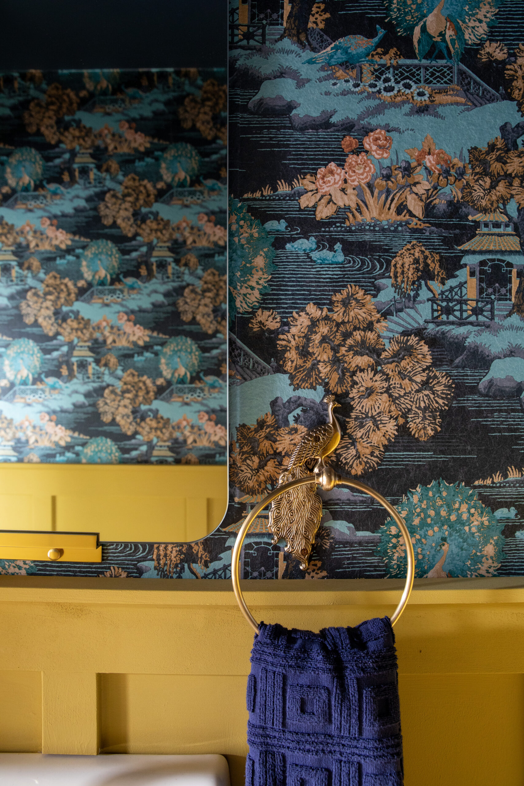
I stumbled across this stunning Edo Toile wallpaper from Graham and Brown and knew I wanted to use this as the foundation for the entire space.

The rest of the colour palette in the room is pulled directly from the wallpaper – the panelling is painted in Burnt Saffron and the ceiling evokes a night sky in this inky Rumour paint colour, both from Graham and Brown. The floor tile is a diamond-shaped tile from the Joy MZ line available at Euro Tile & Stone here in Ottawa (they also have a location in Toronto) in the colour “dark green” which I would more accurately describe as teal.
AFTER

I opted for brass accents throughout to complement the golden hues in the paper. I couldn’t resist the urge to lean into a bit of kitsch by referencing the peacock pattern in the toile with a matched toilet paper holder and towel ring both from Anthropologie.
As the space is quite petite, I wanted to maximize the floor area by selecting a wall-mounted sink by Kohler with gold faucet and fixtures from Kibi. Melanie and I agreed that a white sink and toilet would be too stark for the space and went with a softer “biscuit” finish on both for a more antiqued feel. The wall-mounted hand soap bracket in brass eliminates clutter on the sink.

I wanted to make the space feel bigger with a tall mirror that celebrates the height of the room and reflects the beauty of the wallpaper in its full glory.
To add a bit of warmth and organic texture, I picked up a small jute area rug off Etsy to break up the floor tile and offer more comfort under foot in the winter months. The Reese pendant by Mitzi Lighting casts a lovely glow on the space and pairs beautifully with the aesthetic, in my humble opinion.

Does that girl in the painting look familiar to you? Oh damn, that’s me! Artist Stephen Frew surprised me last summer by sending me a note on Instagram to say he’d drawn inspiration from one of my photos (this was his inspiration) and painted a portrait of me. I snapped it up right away and had it surrounded with a silk mat and burl wood frame at Framed! on Bank Street.

Michael is fully responsible for all the changes in this room, except for the wallpaper installation which we hired out. He painstakingly chipped out the old tile floor, installed the new tile, the panelling, the toilet, sink, painted the entire room (with some help from your truly), hung the mirror, soap dispenser, towel ring, and the artwork. After all that, I told him the room was complete, that is until I decided we needed to upgrade the light switch to this lovely brass toggle version from Buster + Punch.

If you hadn’t already guessed, I’m not the kind of homeowner who is preoccupied with “resale value” and elects to paint everything in white and grey to appeal to the widest possible audience of prospective buyer. I subscribe to the school of thought that your home should be a reflection of your personality and bring you some modicum of joy each day. So, I know the bold choices in this powder room might not be for everyone, but, for me, they’re perfect.


stunning!
Wow!! your creativity never stops! Thanks for sharing the details and where to shop!
Connie