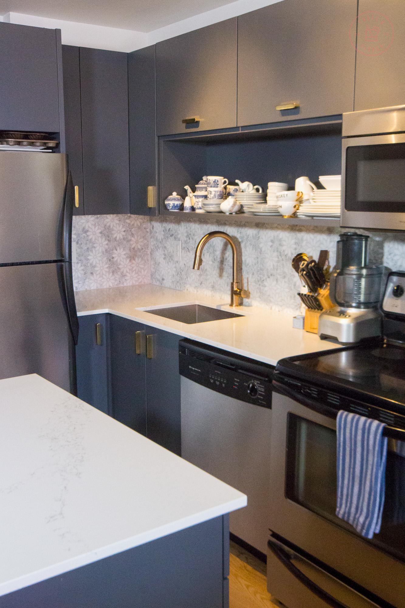
As a single food blogger, you might not be surprised to learn that the kitchen is where the magic *actually* happens. The only sorcery that happens in my bedroom is self-deception.
To my chagrin, the kitchen in my condo was pretty uninspiring when I first moved in. Much like the rest of the place, it was a study in shades of brown.
Disclosure: This post contains affiliate links. If you buy something through some of the links in this post, you won’t pay a penny more, but we’ll get a small commission, which helps keep the bar stocked.
BEFORE

AFTER

Black granite countertops and ruddy brown cabinetry made the space feel dark and dated. In my north-facing unit, the kitchen is farthest from the windows making natural light a near impossibility. In hindsight, I wish I had considered the location of the kitchen/availability of natural light more carefully when I was house-hunting.
I’ve always been enamoured with the combination of navy and white with brass details but the potency of the palette was really solidified a couple of years ago when I went on the Glebe House Tour.

We stopped in at a recently renovated century-home with a modern open-concept kitchen with stunning dark blue-grey cabinetry, Calacatta marble countertops with walnut accents and brass fixtures. Be still my beating heart.
Luckily, being a house tour, the helpful volunteers had full lists of all the details and I discovered that blue-grey paint colour I loved so much was called Cyberspace by Sherwin Williams. I knew I wanted to do a lipstick makeover of my kitchen from the first moment I stepped foot in it and had a vision.
BEFORE

AFTER

SHOP THE ROOM

I worked with the talented team at Roll Her Sleeves Painting to put a fresh coat of Cyberspace on the drab brown cabinetry (also the team that installed that statement wallpaper in my bedroom).
The sad Ikea door/drawer pulls needed to go too. Small silver tabs mounted to tops of drawers and bottoms of doors were totally charmless and had a tendency to jab you in the crotch when working at the island because the builder cheaped out on the countertop dimensions so the granite was flush with the cabinetry, instead of having the usual 1″ overhang.

I opted for the stylish and timeless Bowman Drawer Pull in aged brass from Rejuventation. It’s shocking how quick it adds up when you need 19 drawer pulls, but #worthit.
The original faucet was clearly intended for use in a bathroom – it didn’t have an extendable hose or spray function. I eventually bit the bullet and invested in a new Delta faucet in brass to coordinate with the hardware. Having a spray function and adjustable hose made it well worth the investment – anything for less scrubbing.

While I don’t have anything against white subway tile, I knew I wanted a high-impact backsplash as the crowning jewel in my kitchen. I opted for this stunning two-tone floral marble mosaic from Euro Tile & Stone. With a small space, this eclectic and feminine tile really makes a statement.
In the few months before I began my kitchen renovation in earnest, the black granite countertops and over-mount sink were my two biggest headaches. The sparkly, high-shine black granite would show *every* drop of water and NEVER looked clean, no matter how hard or carefully I buffed and polished.

And is there anything worse than not being able to sweep crumbs from your countertop into the sink? I think not. I love the look of a square, sharp-edged undermount sink and opted for this model from Bianco.
For the countertops, I went to opposite ends of the colour wheel and swapped the black for white Carrara marble inspired quartz called Yorkville by HanStone sourced from Euro Tile & Stone.

In terms of styling, I hated the look of the clutter perched atop the cabinets (which you can peep in the before photos) and have done my best to cram everything into the available storage in the kitchen or closets. In spite of being a food blogger, I really try to avoid buying superfluous small appliances.
The only gadgets I keep out on a daily basis are my Breville food processor
(which I love) and my Cuisinart kettle. Otherwise, my toaster, KitchenAid stand mixer, blender, and immersion circulator all stay tucked away out of sight.

My knife block and stylish kitchen crock from local ceramist Vanessa Villareal sit beside my food processor and I keep some “fashion” cutting boards and bar tools on the other side of my range. My brass peacock spoon rest from CB2 (last season) adds a bit of flare to the stovetop.
I’ve done my best to style the open shelving component of the kitchen with my Blue Willow pattern plates and white plates to compliment the colour palette. I’m still considering a fluted glass cabinet door with brass edging and handle to add a bit of polish and make the space feel more finished but I’m undecided.

I haven’t updated any of the applianced but am definitely considering an upgrade to the 10-year-old oven that takes a solid 30 minutes to preheat and sets off the smoke alarm anytime it reaches 400 degrees thanks to all the baked on debris on the bottom (trust me, I’ve tried everything to lift this grime).
Would love your recommendations for your favourite electric ranges in the comments below – bonus points for an induction cooktop!
On the whole, I’m really happy with this transformation and am elated I was able to affect such a change for less than $5,000!

