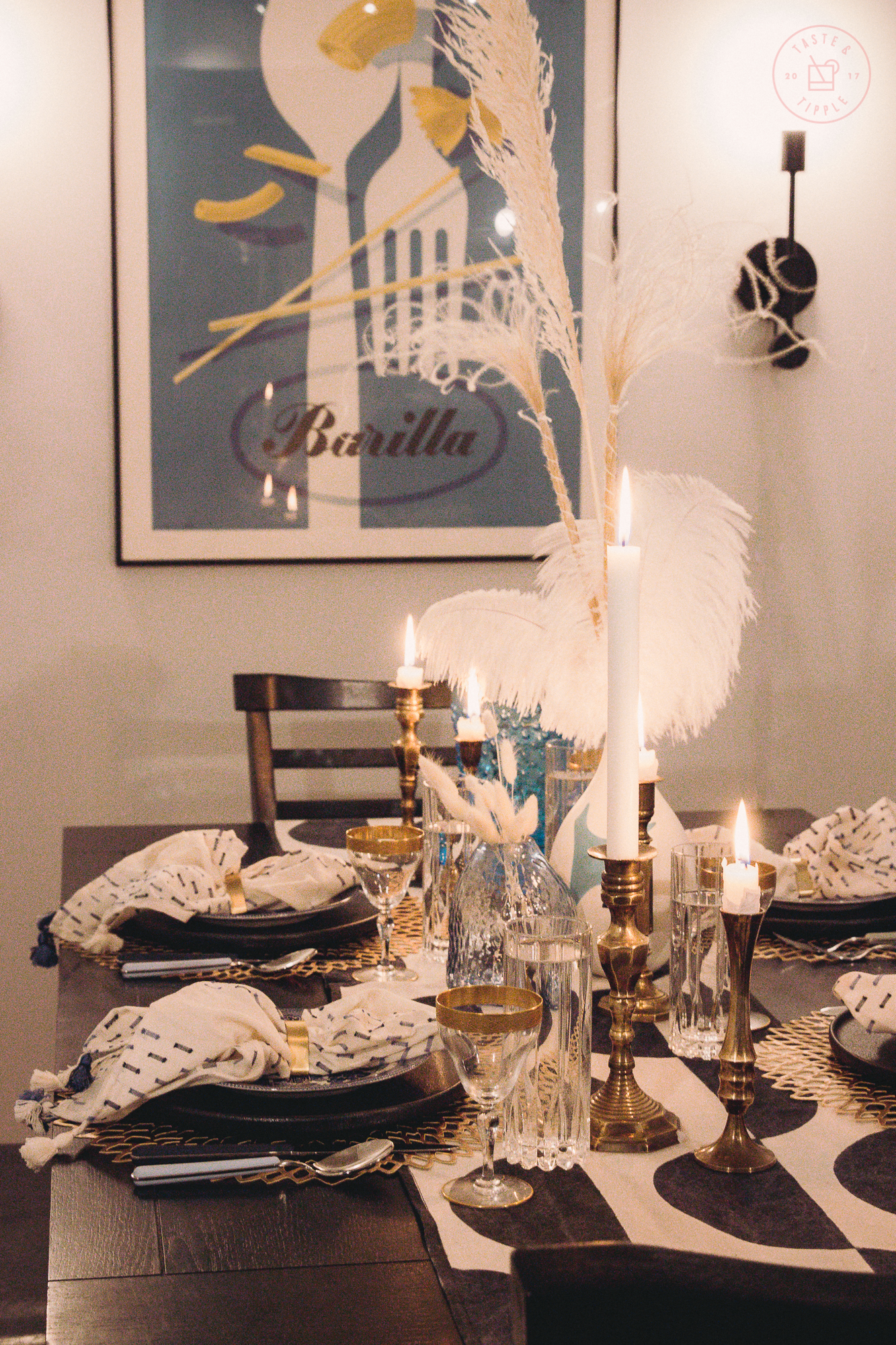
As you may have guessed, I’m not doing much entertaining these days but I’m always looking for an opportunity to craft a beautiful tablescape. I ordered some new table linens and accessories before we were locked down and wanted to pull them all together in a curated dining design that would accentuate the colour palette of my dining room.
When I moved in this room was just a den, the room immediately to your right as you come in the front door, across from the kitchen. It was a hugely under-utilized space and I had no interest in making it a home office – there’s no natural light in the room and staring at a wall in a dimly lit room seems more like a prison sentence than an appealing work environment.

SHOP THE LOOK

I ordered this Rifle Paper Co. rug to brighten up the space and tie in the grey/blue colour palette. I painted the walls a very light grey called Silver Screen by Behr.
The space had absolutely no lighting whatsoever so I ordered these sconces from Schoolhouse. The sliding doors on the right side of the space hide my laundry and storage closets.
BEFORE

AFTER

I took my cues for the colour palette and clean aesthetic for the dining space from my vintage Barilla poster that I picked up at one of my favourite stores ever, L’Affichiste in Montreal. L’Affichiste offers a selection of vintage posters – first or second-run lithograph prints from the original era in which they were posted.
This Barilla poster was designed in 1951 by famous Italian architect and illustrator, Erberto Carboni. You can occasionally find reproductions of this piece on poster websites or original linen-backed lithograph prints like this one on Etsy.

As the ceilings are quite high throughout my condo, I wanted to add height to the tablescape with the pampas grasses and feathers in the centrepiece. I introduced gold accents with an assortment of vintage brass candlesticks, gold geometric napkin rings from CB2, metallic placemats, and vintage glassware.
I leaned into the graphic composition of the poster with the block print tablerunner and black dinner plates.

As someone who takes a lot of pictures of food, I definitely have more dishware, glassware, and flatware than the average bear. I requested this stunning colour-coordinated flatware by Mepra for Christmas. It reminds me of a bigger, updated version of those baby spoons with the rounded rainbow-coloured handles our parents used to feed us when we were toddlers.
My mom starting acquiring a complete set of Blue Willow dishes for me when I was just a kid, so I’m fortunate to have a full complement of this timeless pattern. I’ve mixed in blue willow side plates on top of the black dinner plates to unify the look and topped it off with these embroidered linen napkins from Anthropologie (unfortunately sold out).

I’ve owned this dining set since 2007 so it would be impossible to link to this furniture now but I’ve included a link to a table with a similar look and feel from West Elm.
My favourite feature of my dining set is how the dining bench opens up for extra storage. I keep all my spare table linens and placemats in the dining bench – it’s a total lifesaver in a small condo.
Overall, I’m delighted with how the space turned out and look forward to hosting lots of dinner parties when we’re allowed to socialize again!


This is an eclectic table setting. For me personally, it sets the mood for conversations in art and travel.
Let’s hope this lockdown ends soon as we are all missing dining with our friends and family.
Cheers